What is responsive design? Most people vaguely understand that it refers to websites that work just as well on desktops as they do on smartphones, but there’s a lot more to it than that, leading to widespread confusion (heck, I’ll admit, I’ve even been known to misuse it myself, even after fellow Co.Design writer John Pavlus called me a dummy for it).
But the principles of responsive design aren’t that hard to understand, thanks to this amazing collection of animated GIFs put together by the guys Froont, a San Francisco-based company specializing in making tools for designers to create responsive websites. Spend just a few minutes with these GIFs, and you’ll never be hoightily corrected by a design pedant about “responsive websites” versus “adaptive websites” ever again. In fact, you can be that hoighty pedant!
The GIFs below show many of the basic principles of responsive designs, with explaining quotes by Froont co-founder Sandijs Ruluks.
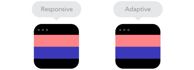
Responsive designs fluidly expand, whereas adaptive designs hitch as you expand a browser or viewport.
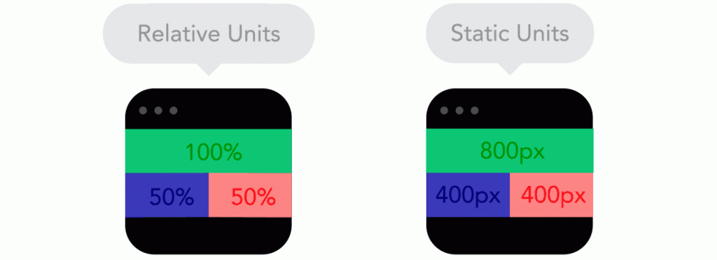
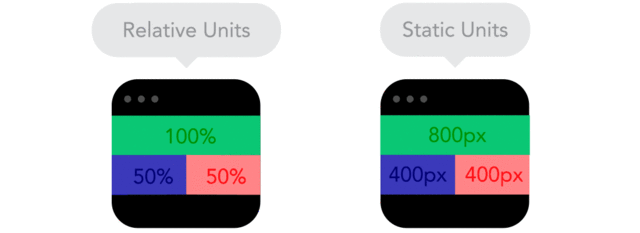
Positioning your designs elements using pixels as X,Y coordinates can cause a site designed for one screen to look weird on another. Use relative units, like percent of the screen, instead of static units like pixels.
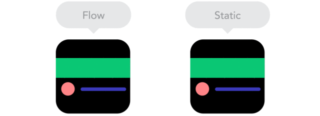
“As screen sizes become smaller, content starts to take up more vertical space and anything below will be pushed down. It’s called the flow.”
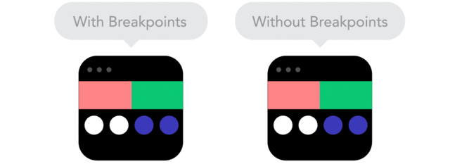
“Breakpoints allow the layout to change at predefined points, i.e. having three columns on a desktop, but only one column on a mobile device.”
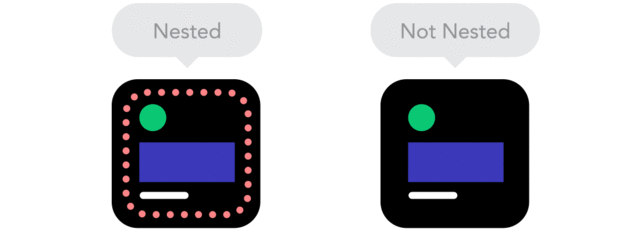
By using nesting elements, you can make it so collections of onscreen elements adapt to a shrinking or expanding screen as one, instead of individually.
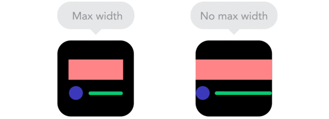
“Sometimes it’s great that content takes up the whole width of a screen, like on a mobile device, but having the same content stretching to the whole width of your TV screen often makes less sense.”
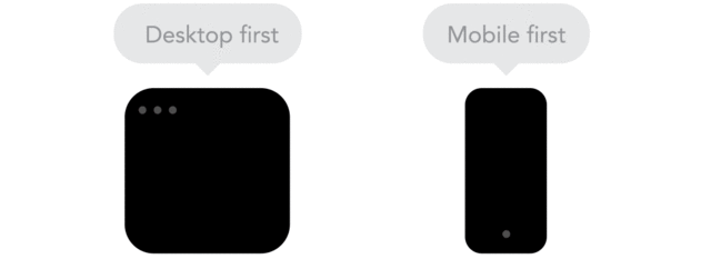
“Technically there isn’t much of a difference if a project is started from a smaller screen to a bigger screen (mobile first) or vice versa (desktop first). Yet it adds extra limitations and helps you make decisions if you start with mobile first.”
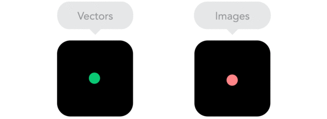
“Does your icon have lot of details and some fancy effects applied? If yes, use a bitmap. If not, consider using a vector image.” A vector image can more properly adapt to different resolutions.
Make sure to read Froont’s full post on responsive design here.